Star Wars: The Force Awakens opens in theaters today! What better time to recreate the iconic opening crawl using just HTML and CSS.
#HTML
The HTML is straightforward. The first div holds the introductory text. It appears centered on screen, then fades out to make room for the scrolling text:
HTML
<div class="a-long-time-ago">
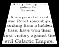
A long time ago, in a galaxy far,
<br> far away...
</div>
<div class="crawl">
<div>
<p>
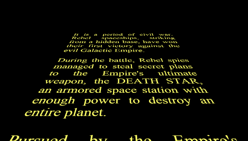
It is a period of civil war. Rebel spaceships, striking from a hidden base,
have won their first victory against the evil Galactic Empire.
</p>
<p>
During the battle, Rebel spies managed to steal secret plans to the Empire's ultimate weapon,
the DEATH STAR, an armored space station with enough power to destroy an entire planet.
</p>
<p>
Pursued by the Empire's sinister agents, Princess Leia races home aboard her starship,
custodian of the stolen plan that can save her people and restore freedom to the galaxy...
</p>
</div>
</div>
#CSS
The CSS is a bit more involved, so let's walk through it step by step. First, the basics: a black background and yellow text:
CSS
html,
body {
    width: 100%;
    height: 100%;
    background: black;
    margin: 0;
    overflow: hidden; /* Avoid the scrollbar */

    /* Center the elements */
    display: flex;
    align-items: center;
    justify-content: center;
}
Flexbox is very practical for element placement, including simple cases like vertical centering. To learn more, check out the documentation about flexbox on MDN.
#Animations
Next, display the opening sentence centered on screen and animate it to fade out. To do this, I use the animation property along with @keyframes, which let you define property values at each point in the animation. The timing-function controls how the transition between states is interpolated.
CSS
.a-long-time-ago {
    font-size: 32px;
    color: #4bd5ee;
    /* Animation */
    opacity: 0;
    animation-delay: 1s;
    animation-duration: 1s;
    animation-name: a-long-time-ago;
    animation-timing-function: ease-out;
}

@keyframes a-long-time-ago {
    0%   { opacity: 0; }
    20%  { opacity: 1; }
    80%  { opacity: 1; }
    100% { opacity: 0; }
}
For the scrolling text, the approach is the same: animate the text moving from the bottom to the top of the screen. To create the illusion that it is receding toward the horizon, a 3D transformation is applied: transform: perspective(280px) rotateX(25deg);.
Here is the result of this transformation on a square:
#Result
Source code of the demo: demo.zipTo take it further, you can add music using the HTML5 <audio> element. Provide multiple formats to ensure compatibility across browsers:
HTML
<audio preload="auto">
    <source src="Star-Wars.ogg" type="audio/ogg" />
    <source src="Star-Wars.mp3" type="audio/mpeg" />
</audio>
#Side note
For episode 4, the credits were made like this:
There is no need for modern technologies when you have good ideas 😉
Do you have a question or a suggestion about this post? Contact me!