Web pages are increasingly heavier from year to year. To convince you, you can look at this graphic made by Tammy Everts on Soasta's blog:
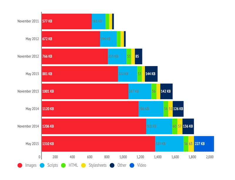
As you can see, images represent over 60% of the total page weight. Faster connections have led website builders to add more and more images to illustrate their pages. However, this comes with several downsides:
- Image transfer consumes server bandwidth
- Pages take longer to load
- Higher hosting costs if you pay by volume (storage and bandwidth)
- Higher costs for users on metered data plans
How to remedy this?
#Compress images
The first solution is to reduce the size of images while maintaining acceptable quality. This requires using formats that offer good compression and broad browser support. PNG and JPG are good candidates. Techniques such as reducing the color palette can yield better compression ratios with no visible loss in quality (always verify the result). Various web services and tools exist to compress images: tinyjpg, tinypng, jpegmini, compressor.io. If you use Grunt, Gulp, or any other Node-based build tool, there are also plugins available: imagemin (Node), grunt-contrib-imagemin (Grunt), gulp-imagemin (Gulp).
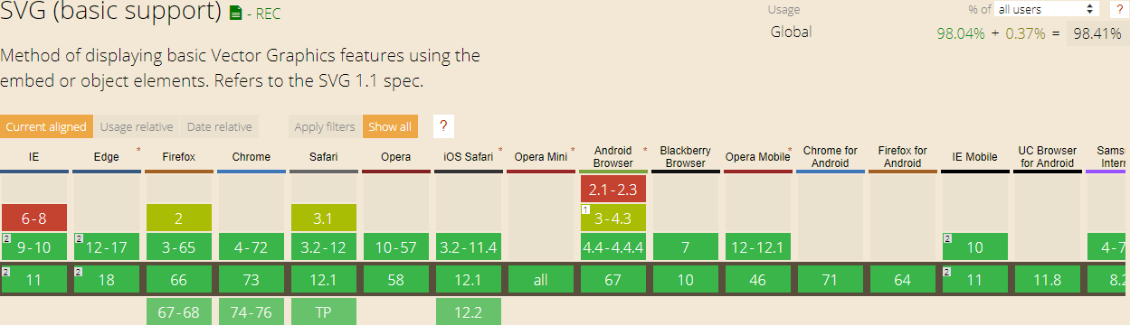
Another option is to use vector images when the image is simple. A vector image describes shapes using geometric primitives (points, lines, Bézier curves, etc.). Note that a complex image may be larger as a vector than as a raster image (Bitmap / Raster). SVG is well supported by browsers (source: Can I use). For example, the icons on this website are SVG files.
If needed, you can provide a fallback to a raster image:
HTML
<img src="logo.svg" onerror="this.removeAttribute('onerror'); this.src='logo.png'">
#Provide an image at the right size
The next step is to serve images at the right size. There is no point in delivering a 1000px-wide image if it will only be displayed at 200px via CSS. This is straightforward for fixed-size images, but for responsive sites it becomes more complex. HTML5 provides solutions, including the srcset attribute, which lets the browser select the most appropriate image based on screen size and pixel density:
HTML
<img src="image-src.png"
     srcset="image-medium1x.png 600w 1x,
             image-medium2x.png 600w 2x,
             image-large.png 2000w">
In the case of an image in the CSS, for example, background-image, it is possible to use the media queries to choose the right image:
CSS
@media (max-width: 640px) {
  .sample {
    background-image: url(image_640.png);
  }
}

@media (max-width: 1000px) {
  .sample {
    background-image: url(image_1000.png);
  }
}
You can also provide different stylesheets for each size:
HTML
<link rel="stylesheet" media="screen and (max-width: 640px)" href="screen_640.css" type="text/css" />
<link rel="stylesheet" media="screen and (max-width: 1000px)" href="screen_1000.css" type="text/css" />
#Combine images (Sprites / Fonts)
CSS allows you to specify images for properties such as background or list-item, which helps decorate pages with images or icons. When many small images are referenced in CSS, it can slow down page load times (less of an issue with HTTP/2). The solution is to combine all small images into one and use the CSS background-position property to display the correct region of the combined image.
CSS
/* Multiple image */
.image1 {
    background-image: url("bg-1.png");
}
.image2 {
    background-image: url("bg-2.png");
}
CSS
/* Single image that contains multiple images*/
.image1 {
    background-image: url("sprite.png");
    background-position: 0px 0px;
}
.image2 {
    background-image: url("sprite.png");
    background-position: -16px 0px;
}
There are many services for generating sprites and associated CSS sheets from a list of images. For example: spritegen, node-sprite or grunt-spritesmith.
If you use vector images, you can create icon fonts where each character maps to an icon. For example, this is how Font Awesome works. Tools to create such fonts include: gulp-iconfont, grunt-webfont, etc.
CSS
@font-face {
  font-family: 'MyFont';
  src: url('../fonts/fontawesome-webfont.eot');
  /* TODO add other font format (woff, woff2, ttf, svg) */
}

.icon1 {
  font: MyFont;
  content: "\f02f"; /* Unicode character of the icon in the font */
}
#Load images as needed
If you examine most pages, you will find that some images are visible as soon as the page loads while others only appear after scrolling. This can be leveraged by loading images only when they enter the viewport.
Many libraries exist for lazy-loading images. Here are some examples: Lazy load XT, Unveil, lazyload. These libraries vary in features, but the principle is always the same: use an attribute other than src, typically data-src, to hold the image URL. The script then replaces it with src when the element becomes visible to the user.
If you want to build your own lazy loader, here is a good starting point (in TypeScript):
TypeScript
module LazyLoader {
    const attributeName = "data-src";

    function isElementInViewport(element: Element) {
        const rect = element.getBoundingClientRect();
        return (rect.top >= 0 &&
            rect.left >= 0 &&
            rect.bottom <= (window.innerHeight || document.documentElement.clientHeight) &&
            rect.right <= (window.innerWidth || document.documentElement.clientWidth)
        );
    }

    function loadImagesInViewport() {
        const imgs = document.querySelectorAll(`img[${attributeName}]`);
        for (let i = 0; i < imgs.length; i++) {
            const img = imgs[i] as HTMLImageElement;
            if (isElementInViewport(img)) {
                img.src = img.getAttribute(attributeName);
                img.removeAttribute(attributeName);
            }
        }

        if (imgs.length === 0) {
            unregisterEvents();
        }
    }

    var eventHandler = throttle(100, () => { // throttle: https://gist.github.com/meziantou/8807ee968f1d0b7c5464
        loadImagesInViewport();
    });

    function registerEvents() {
        document.addEventListener("DOMContentLoaded", eventHandler);
        document.addEventListener("load", eventHandler);
        document.addEventListener("scroll", eventHandler);
        document.addEventListener("resize", eventHandler);
    }

    function unregisterEvents() {
        document.removeEventListener("DOMContentLoaded", eventHandler);
        document.removeEventListener("load", eventHandler);
        document.removeEventListener("scroll", eventHandler);
        document.removeEventListener("resize", eventHandler);
    }

    registerEvents();
}
The full code is available on GitHub: https://gist.github.com/meziantou/8807ee968f1d0b7c5464. You will find in particular the code of the method throttle not presented above.
Several improvements are possible. For example, you could add a threshold to start loading images just before they become visible. The srcset attribute and the picture element are not handled. You could also add a placeholder image while loading. If the user has scripts disabled, you can use the noscript tag as a fallback, though you will need to adapt the script above to account for that case.
#Conclusion
Page load time is an important factor in user experience. The techniques presented in this article can significantly improve load times for pages that contain many images. As with any optimization, avoid applying them prematurely. Wait until you identify real performance issues, then apply the appropriate fixes.
Do you have a question or a suggestion about this post? Contact me!