This post is part of the series 'Web Performance'. Be sure to check out the rest of the blog posts of the series!
Images account for a large portion of internet traffic. Reducing image file sizes lowers the amount of data transferred, which can cut hosting costs and help users load images faster.
AV1 Image File Format (AVIF) is a modern image format developed by the Alliance for Open Media (AOM). AVIF is currently supported by Chrome, Firefox, and Opera, covering about 70% of users. Safari will add support starting with iOS 16 and macOS Ventura, and Edge support is also planned.
Because the web supports progressive enhancement, you can serve multiple versions of the same image. By providing both an AVIF and a PNG/JPG version, the browser automatically picks the best format for the user. There is no reason to wait before adopting AVIF!
 Can I use: AVIF image format
#Encoding images to AVIF
There are several tools available to encode images to AVIF.
If you have only a few images and want to fine-tune the compression options for each one, squoosh.app is a great choice. It lets you adjust settings and preview the result in real time so you can verify the output quality.
If you prefer the command line you can use one of the following tools:
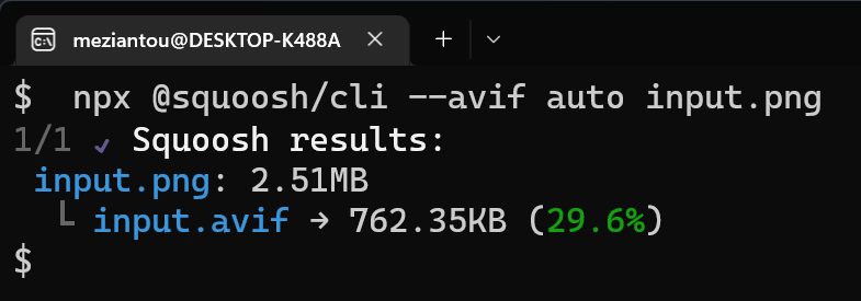
squoosh.app CLI
Shell
npx @squoosh/cli --avif auto input.jpg
avifenc
Shell
avifenc --min 0 --max 63 --minalpha 0 --maxalpha 63 --advanced end-usage=q --advanced cq-level=32 --advanced tune=ssim --speed 0 --jobs 1 --ignore-icc "input.jpg" "output.avif"
ffmpeg
ffmpeg -i input.png output.avif
#Adding AVIF to your website
To maximize compatibility, serve multiple formats of the same image. PNG/JPG works in all browsers, including older ones, while AVIF is supported in modern browsers. By providing both, the browser selects the best option for each user.
The <picture> element allows you to provide multiple sources for the same image.
HTML
<picture>
    <source type="image/avif" srcset="image.avif" />
    <img src="image.png" width="120" height="90" />
</picture>
You can also use srcset to serve different image sizes based on viewport width or screen pixel density.
HTML
<picture>
    <source type="image/avif"
            srcset="image200.avif 200w, image400.avif 400w"
            sizes="50vw" />
    <img src="image.png"
         srcset="image200.png 200w, image400.png 400w"
         sizes="50vw"
         width="120" height="90" />
</picture>
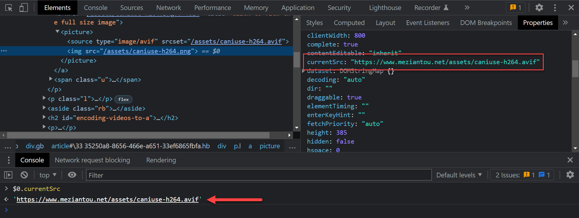
You can validate the image used by the browser by checking the currentSrc property of the img element:
Do you have a question or a suggestion about this post? Contact me!